A brand evolution project combining visual identity, editorial strategy, content production, and social management to turn authenticity into a consistent and scalable communication system.
Our challenge
For Risotto Dai C’andom, we developed a broad and structured communication project designed to strengthen the brand without altering its most valuable quality: its authenticity.
The restaurant already had a spontaneous, direct, and highly relatable way of communicating, built around the strong personality of the founder and team, as well as a natural proximity to its community.
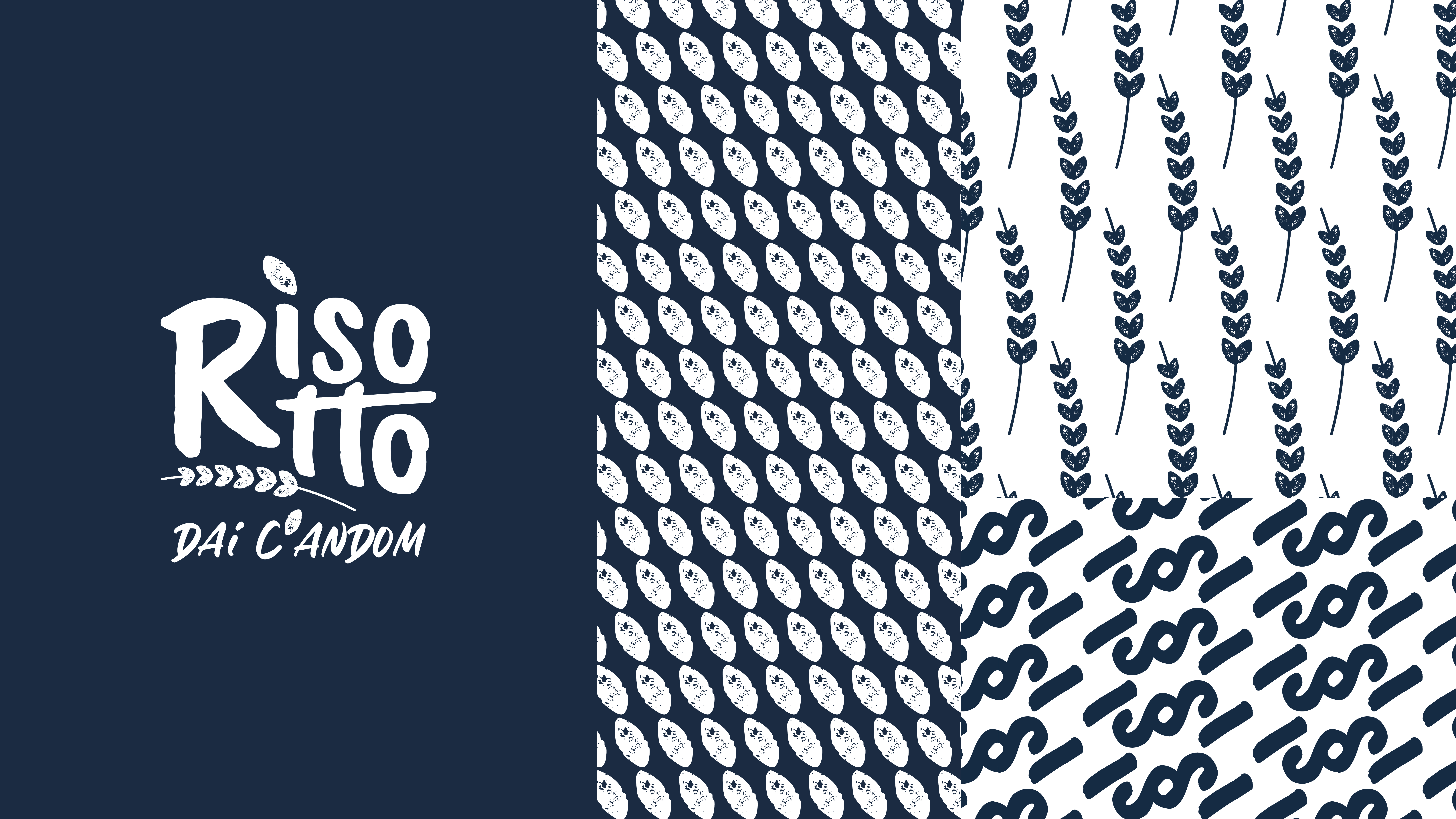
The objective was therefore not to replace that language, but to organize and elevate it, transforming simplicity, irony, and truth into a more coherent and recognizable brand system. The first layer of the project focused on the renewal of the visual identity.
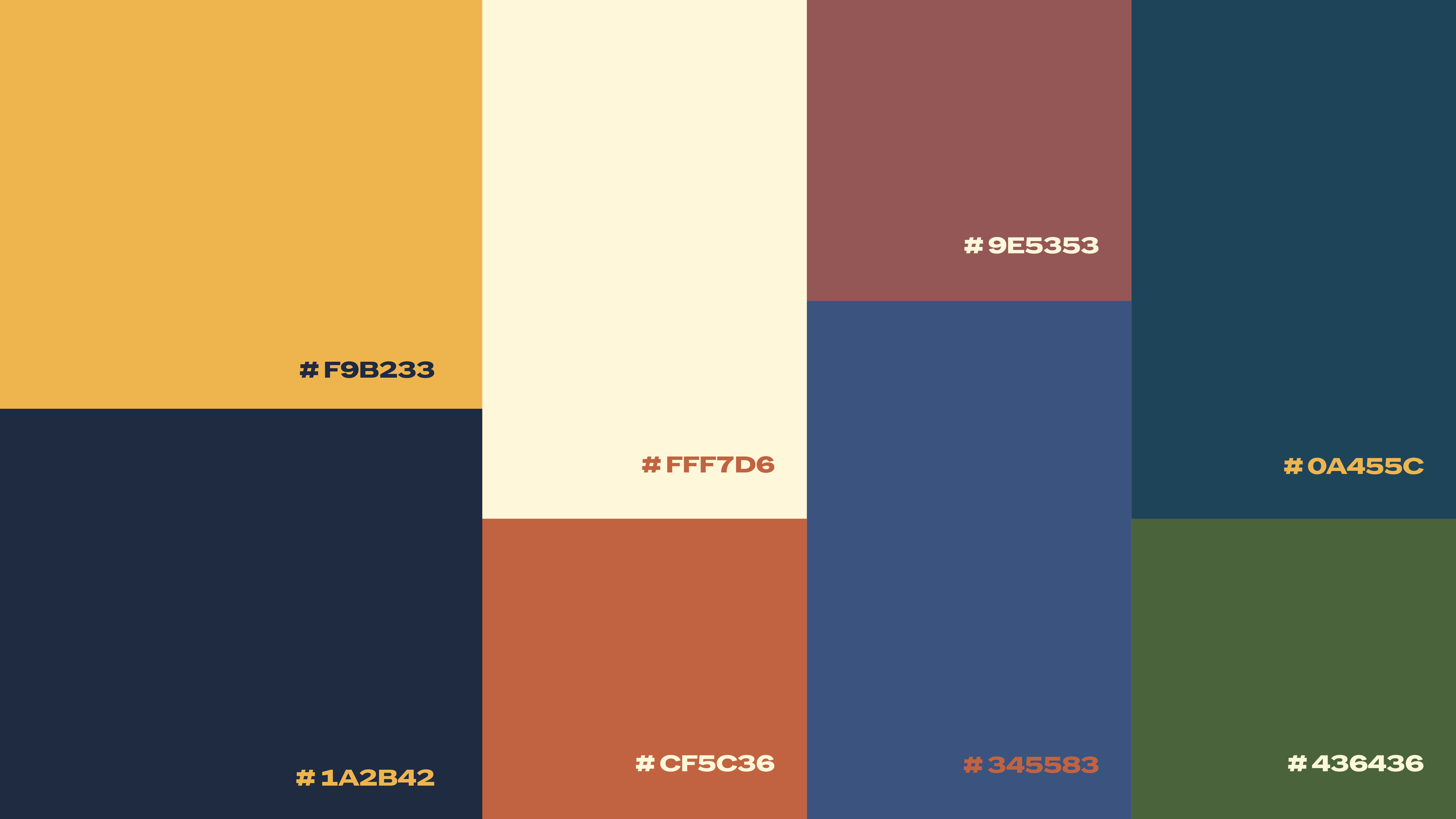
Starting from the original brand assets, we expanded the logo system with new monochromatic variants and built a broader palette rooted in the brand’s existing colors, while also drawing inspiration from the tones of Emilia-Romagna’s urban and cultural landscape. We then introduced a more articulated graphic language, extracting secondary elements directly from the logo, such as the rice grain and the wheat ear, and complementing them with new typographic signs designed to support covers, carousels, and editorial layouts over time. The typography system was also reworked to create a balance between clarity, personality, and warmth, through the combination of a primary sans serif font, a handwritten companion font, and a condensed display typeface for high-impact messages.
An integrated communication system
The second layer of the work focused on strategy, editorial planning, and content production. From the initial analysis, a few clear priorities emerged: consolidating the brand identity, improving the perceived quality of the outputs, increasing format variety, and leveraging contemporary platform languages more effectively.
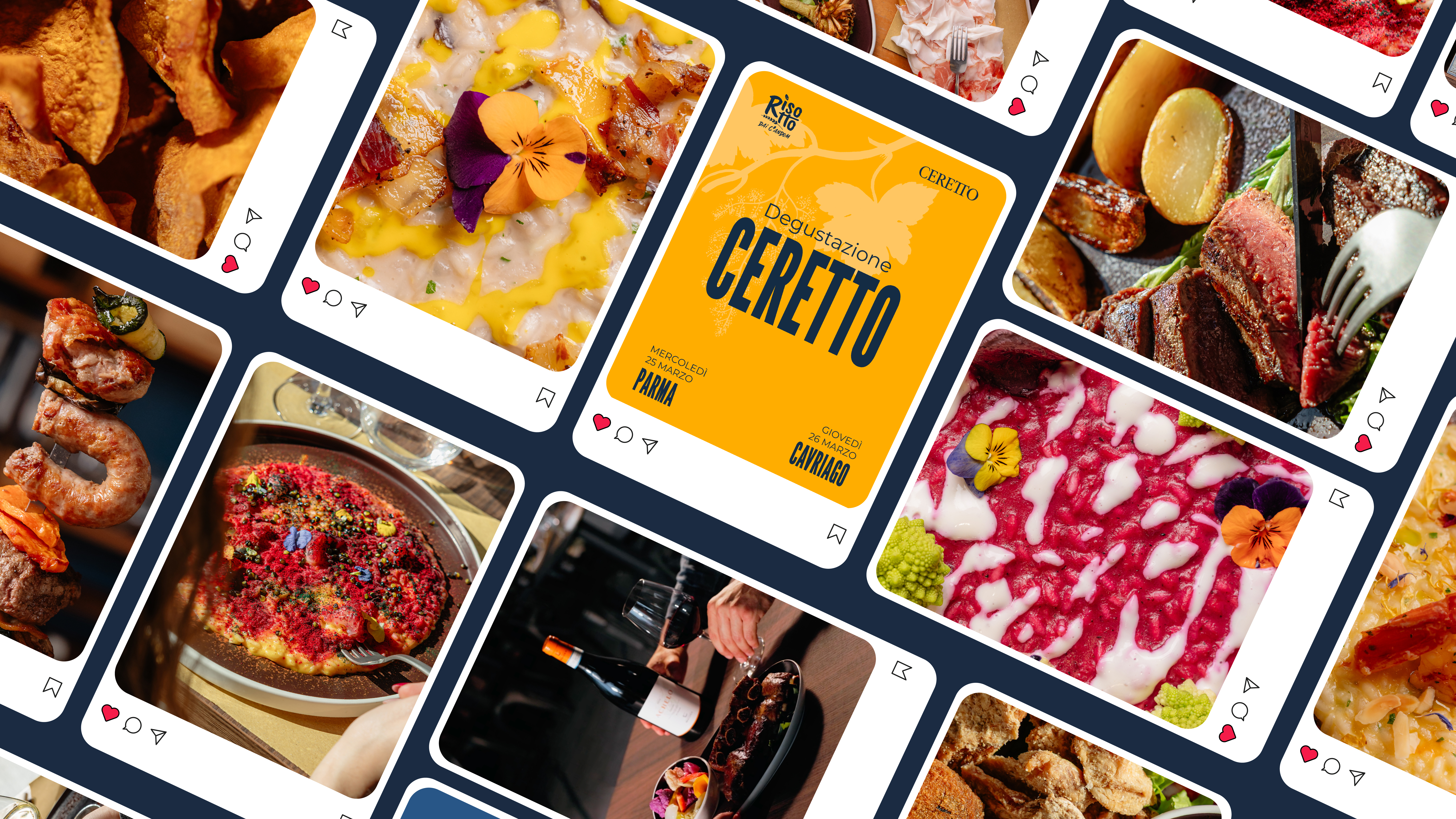
On this basis, we defined a creative concept centered on the emotional core of the brand: “the taste that makes you smile even online”. The strategy was designed to entertain, stimulate appetite, and strengthen memorability, while keeping the tone natural and approachable. This translated into a structured editorial system built around recurring content pillars, including recipes and how-tos, ingredients and suppliers, wine pairings, staff moments, tips, curiosities, and service communications.
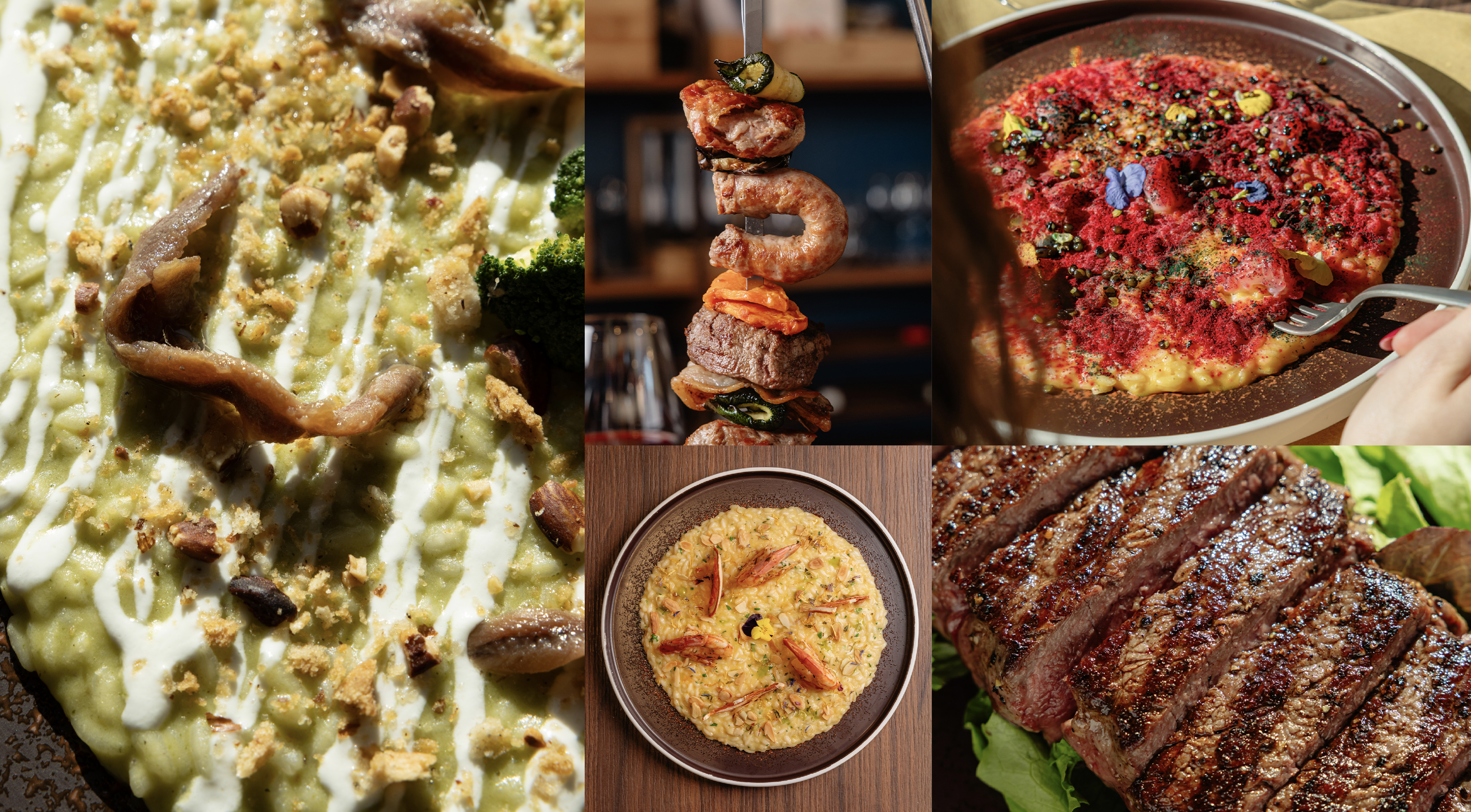
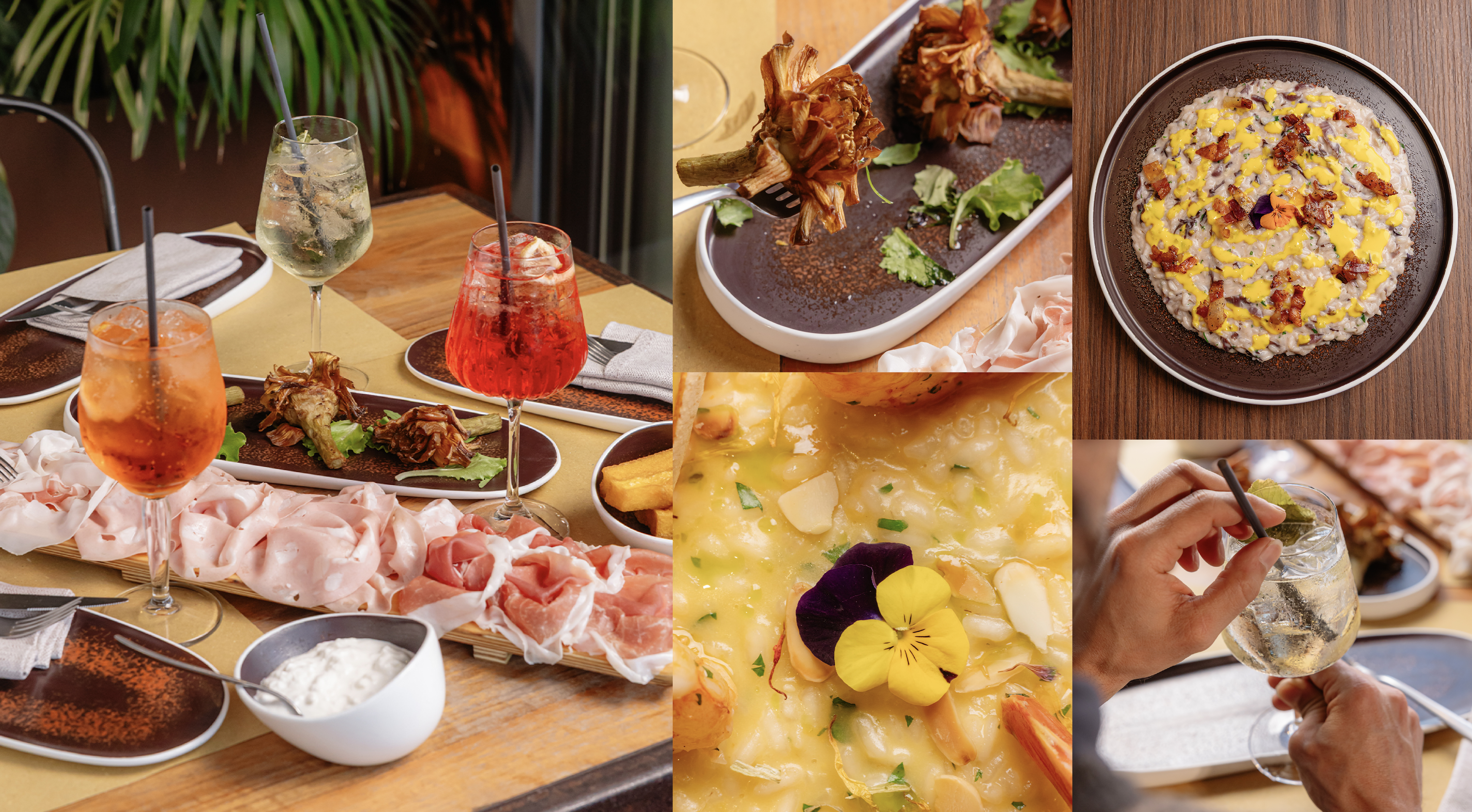
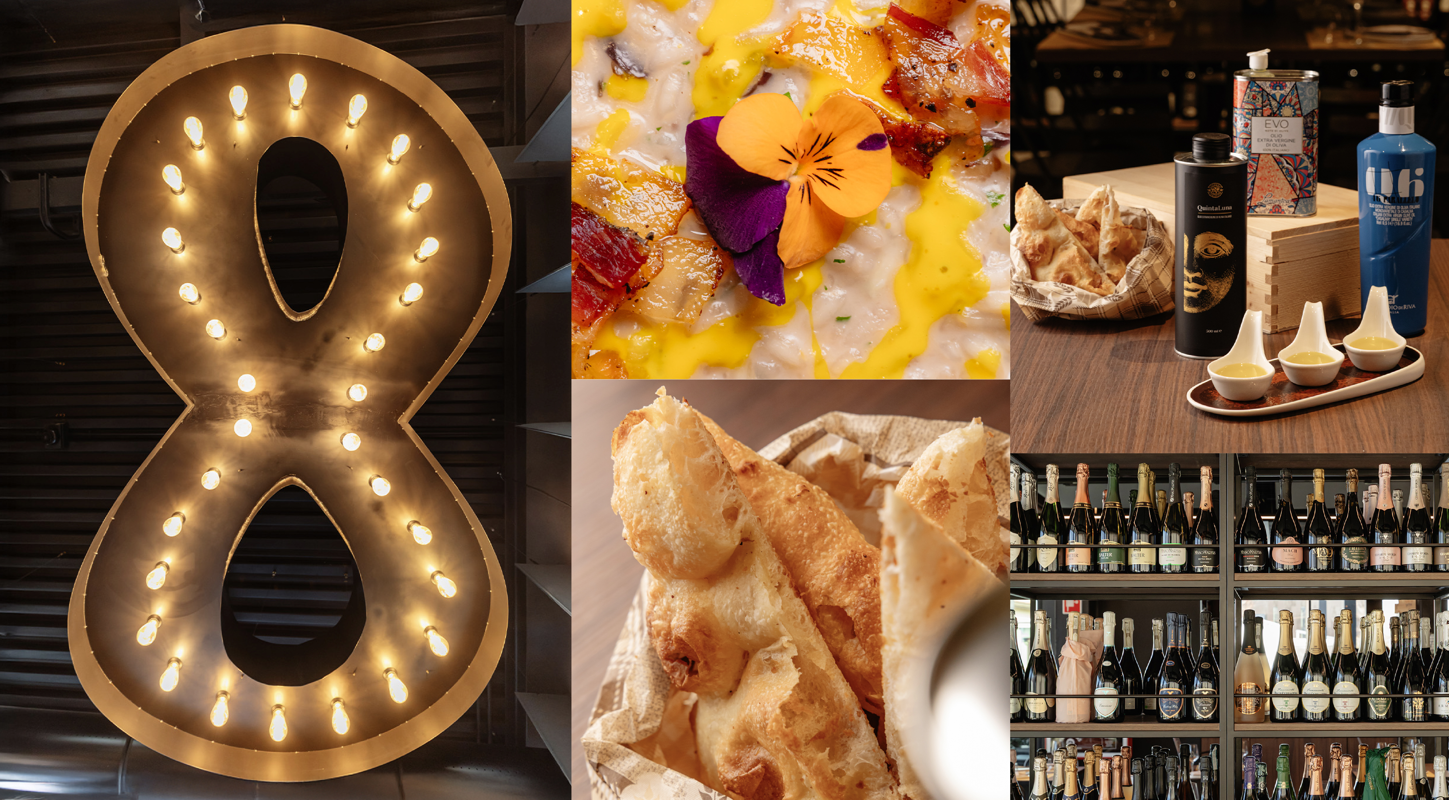
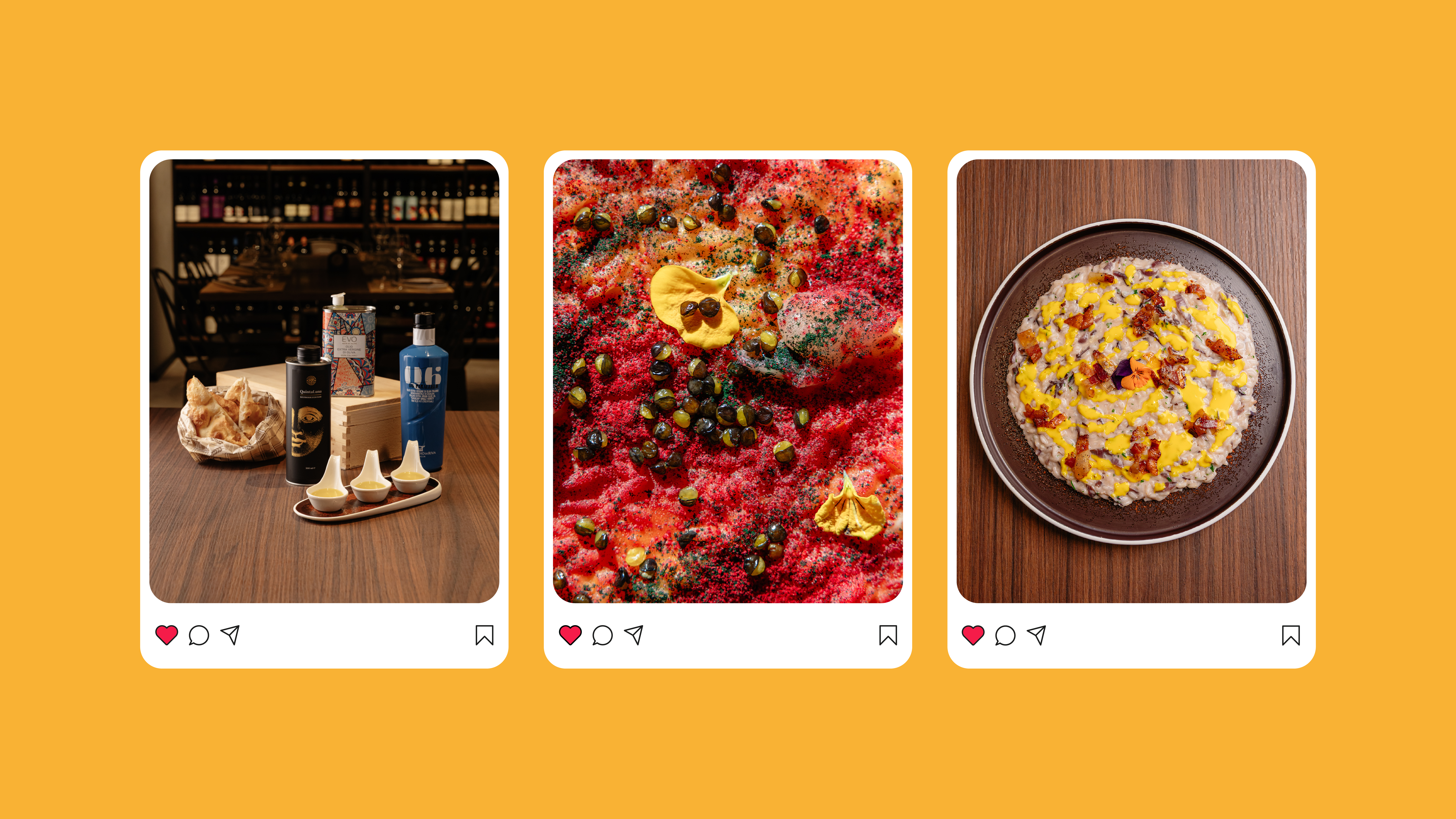
To support this strategy, we are producing an ecosystem of content designed to make the brand more complete and professional while preserving its immediacy: reels, still lifes, top shots, close-ups, ambient photography, informational carousels, and branded graphics. The monthly framework combines trend-based video content with static and carousel formats, creating a more varied and balanced feed and allowing the brand to communicate not only products, but also atmosphere, personality, and service.
The result is an integrated communication system in which visual identity, positioning, editorial thinking, and content production all work together. What was already genuine and effective is now supported by a more solid structure, one that makes Risotto Dai C’andom immediately recognizable, more consistent over time, and better equipped to grow across digital channels.